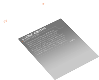


The 100
Conceptual Design
To dig deep into client needs I utilizing my
UI/UX skills and knowledge of software development to create robust user centric applications. Crafting a responsive design that is both intuitive and keeps it user friendly is a staple of development.
UI / UX
DESIGN
Sleek and elegant store front. A modern minimalist approach to youth apparel. Built with seasonal marketing in mind.
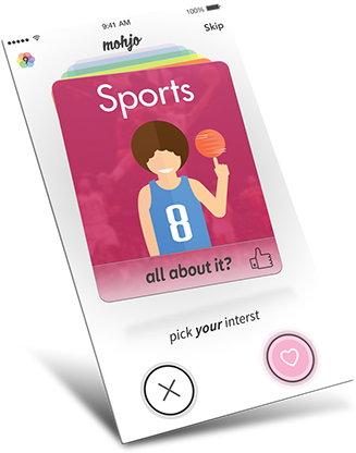
mohjo
Dating
Where Vintage meets modern. Small details like old illustrated icons were added to put a twist on things. A car way before its time.
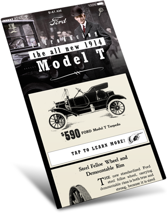
Ford
Model T
Users can add content that updates automatically. Visually useful information that will help you plot your next adventure.
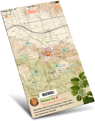
Scout
camping / hiking guide
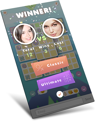
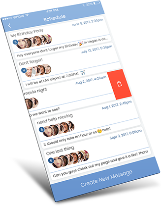
A new spin an a staple of the app culture. What would Tinder look like if it come out in the summer of 1987?
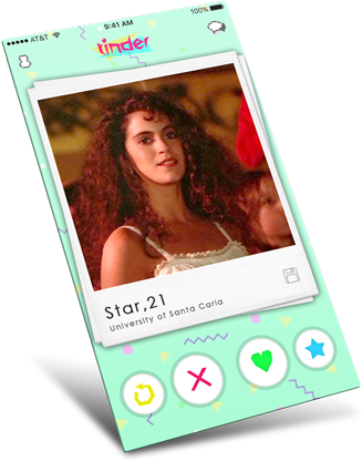
tinder
1987 edition
With full creative freedom with alight I went with a different approach while staying within the company style guide.
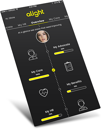
alight
GERAPHIX / Mobile Health
ERChealth's UI/UX was a requested gradient look with large tightly compact button interactions.
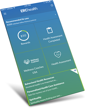
ERChealth
GERAPHIX / Mobile Health
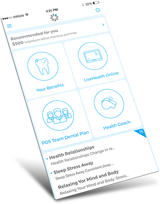
With abd a design was needed for a slightly minimized rewards header. One that still gave the needed information on their goals.
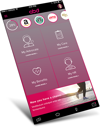
abd
GERAPHIX / Mobile Health
Vivity's logo was implemented with the UI to increase brand awareness and keep theme elements concurrent.
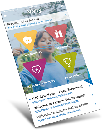
Vivity
GERAPHIX / Mobile Health
With a greater emphasis on user rewards the FedEx UI needed a clear point of interest while keeping all the title sections visible.
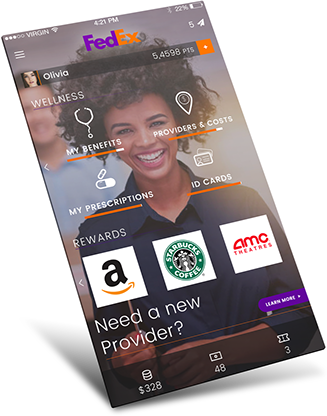
FedEx
GERAPHIX / Mobile Health
Kroger's UI was to quickly and precisely get medical information to the user with necessary results listed.
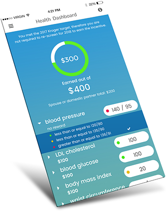
Kroger
GERAPHIX / Mobile Health
Disney's iconic imagery and color scheme was at the for front of this app's design .
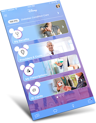
Disney
GERAPHIX / Mobile Health
Keeping with the dental theme it was important to have a clean white UI. Icons have a thin line look reminiscent of floss.
Pacific Dental
GERAPHIX / Mobile Health
A streamlined design with a client requested flat uniform feel. PiGN is a multi messaging and scheduling application.
PiGN
jixtra
Companion app for Pokemon GO. The app's UI not only gives names and details but user verifications system
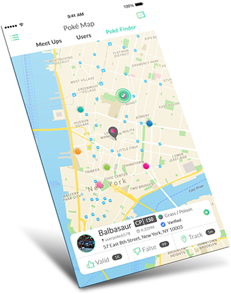
Poke Social
The App Company
A social network for alumni meet ups and exclusive information. USC requested a focus on UI/UX that stressed on seeing other users.
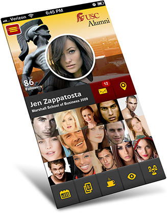
USC Alumni
The App Company
Locations determine coupons and savings. Bazomb's UI/UX is a combination of important information and visual attraction.
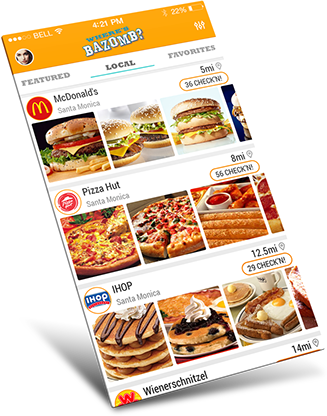
Where's BAZOMB?
Moyo
Wireframes
Prototyping
Icons
UI Design
simulated phone with hot spots for navigation

Mobile Signal
microinteraction
Download
microinteraction

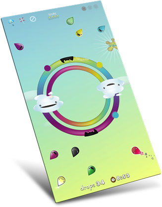
DROPS a game with a twist - and turn. Try to line up the dots with the incoming colored rain drops by rotating the rainbow. Keep the clouds happy and avoid the toxic slimes.
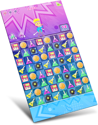
Welcome to the world of Nostalgia. Land of big hair and louder groves. A rhythmic puzzle game fulled with fast pace action. Grab your guitar pick it's time for Manic Match!


Asset Creation
All Game Types
Variations
Animation
Character
Animation
Asset Overlay
Animation
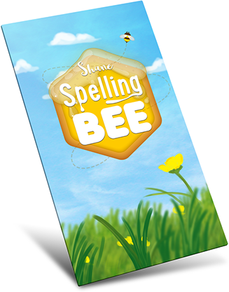
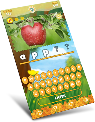
Went for a loose painting almost water color look for backgrounds and splash screen. Logo was designed to keep with the theme of honey and honeycombs.
Knowing our user demographic was key in creating UI that was easy to read and is distinguishable.
The main game area is to put the user in a space that gives room for the UI and button functionality while still creating a bee hive feel.
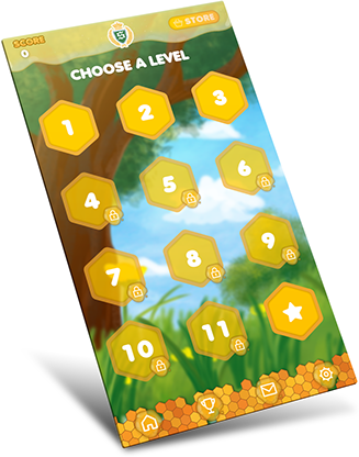
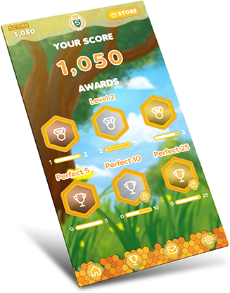
Keeping with the choose a level UI we wanted to make sure the reward system was simple and easy to grasp.
A whimsical take on the classic we all know and love. I conceptually designed it for a wide range of users - keeping it family friendly.
The concept for the UI is to keep with the blocky theme and mimic it throughout the app for a cohesive experience.
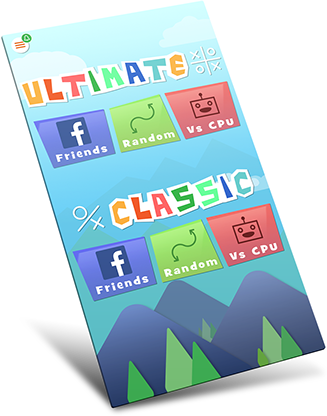
In ultimate game type the players has nine boards to interact with. My design objective was to make sure elements respond to the users interactions while keeping the focus front and center.
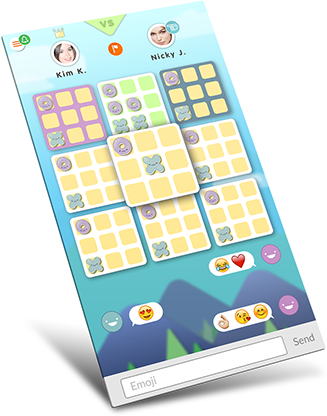
From a UX stand point it has become a gaming staple to have visual feed back that encourages the user to keep going or try again and again.